So Anders and I was chit chatting about this and that today and I told him that I was going to play around with Midjourney to see if it could cough up some inspiration!
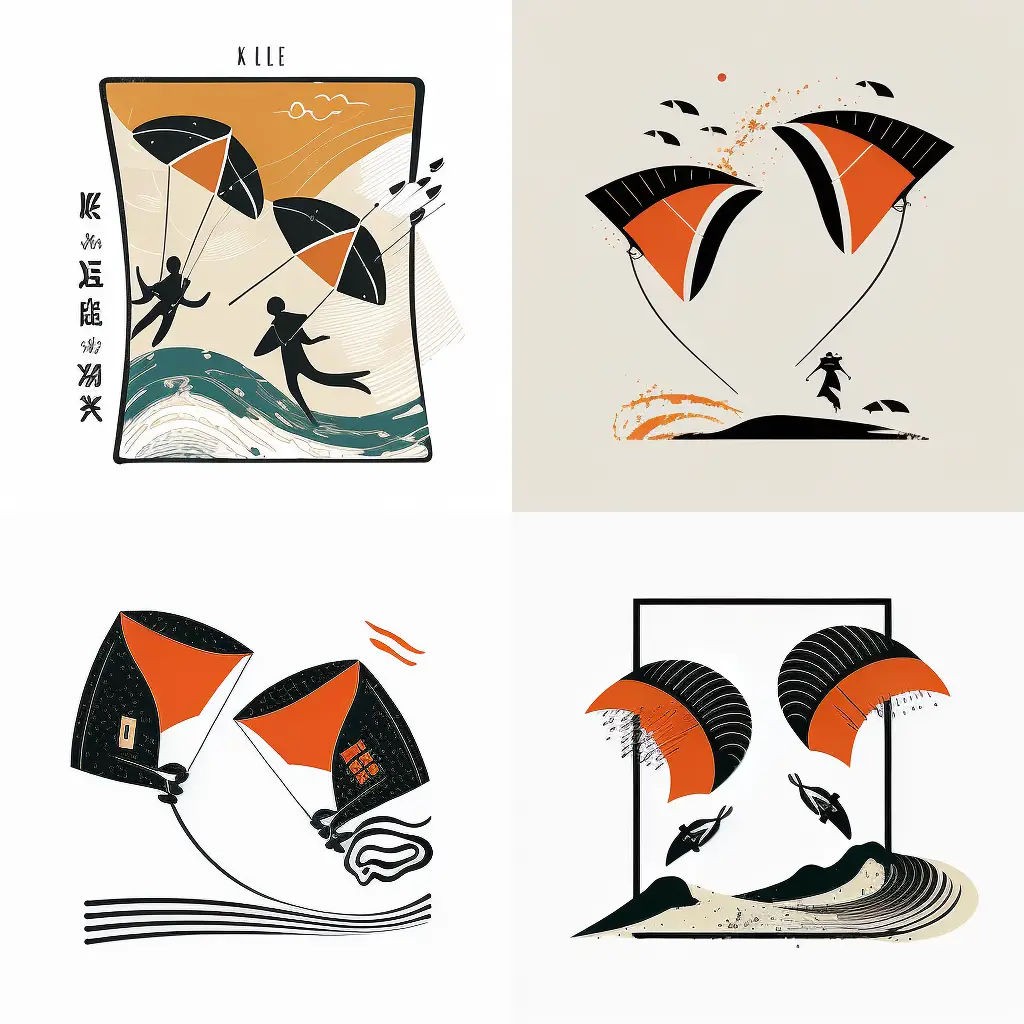
So I logged in and started to do some prompting. The first examples came out like this…
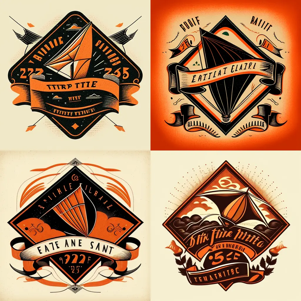
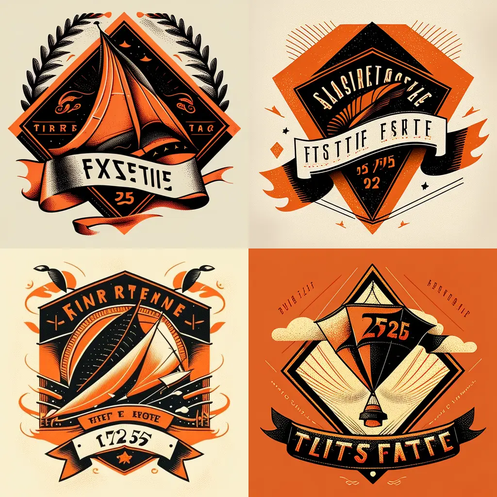
Well… Not too bad, but nothing too breathtaking either. No worries, let’s give it another go and see what happens!
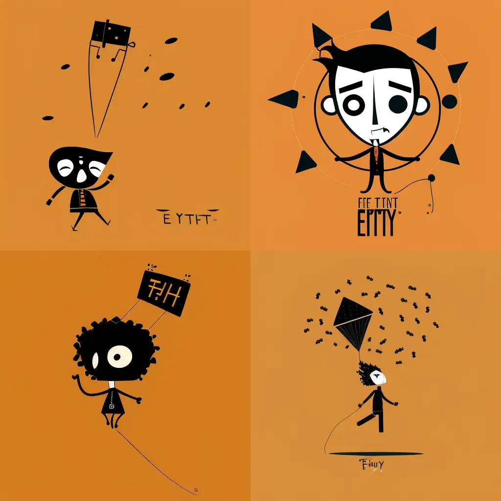
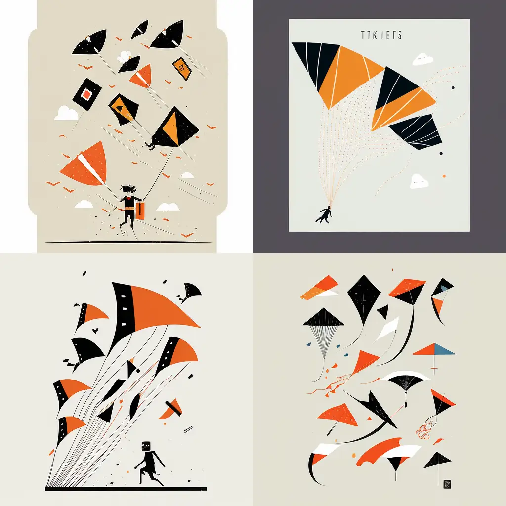
Yes, definitely different and there are some really interesting design elements in there. But what if I try to take a more … circular approach?
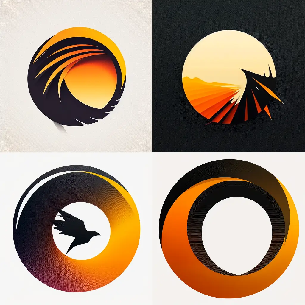
Now, this is starting to look really interesting. Let’s try four more variations!
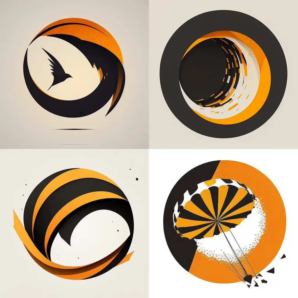
Now we’re talking! I really like the shape of the first one, the one with the silhouette of that hummingbird. The colours are right and the circular shape makes me think of kites!
Let’s remove the bird and see if we’re onto something…
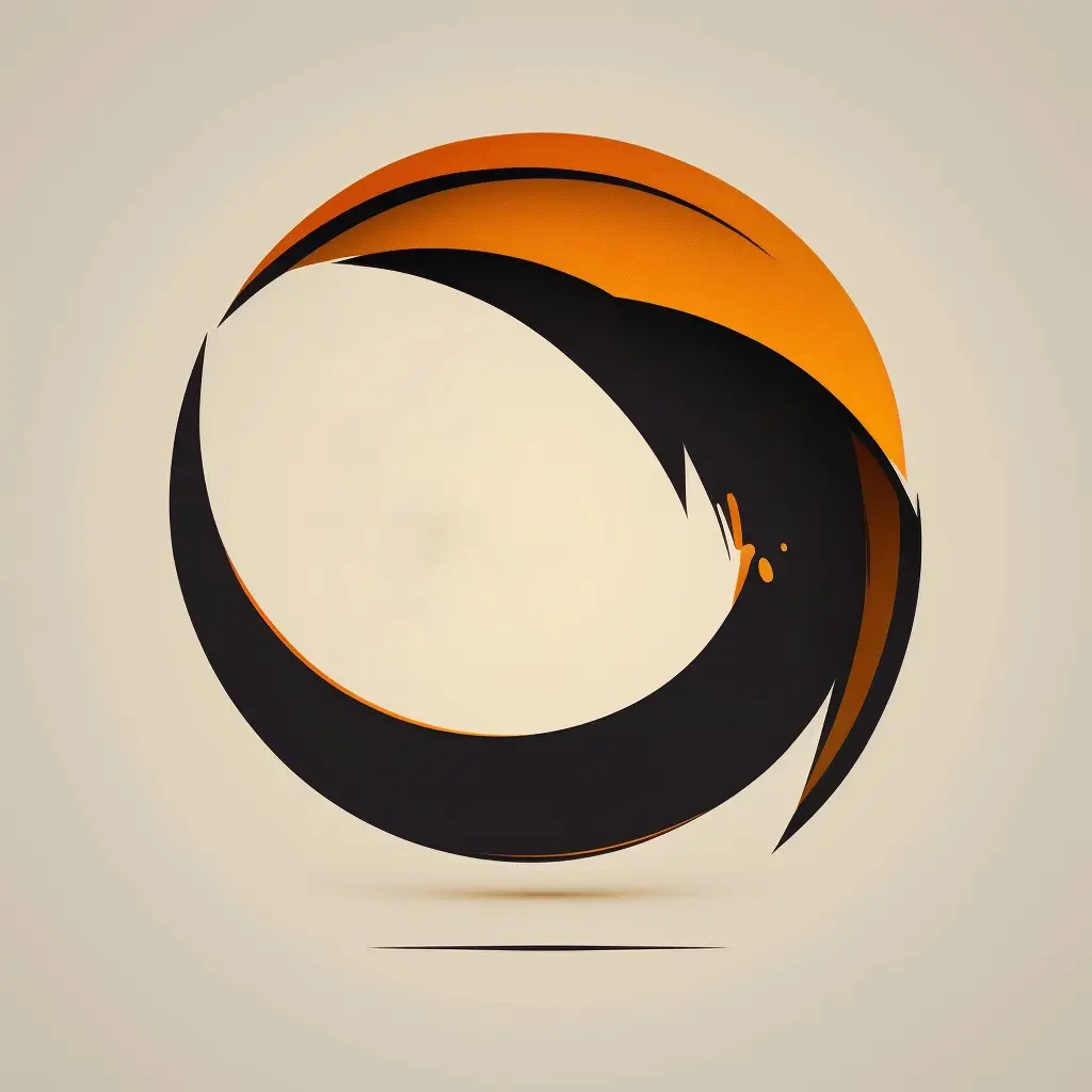
Yes, this is good. I can use this and do some more tweaks, adding some text and see what I can end up with!
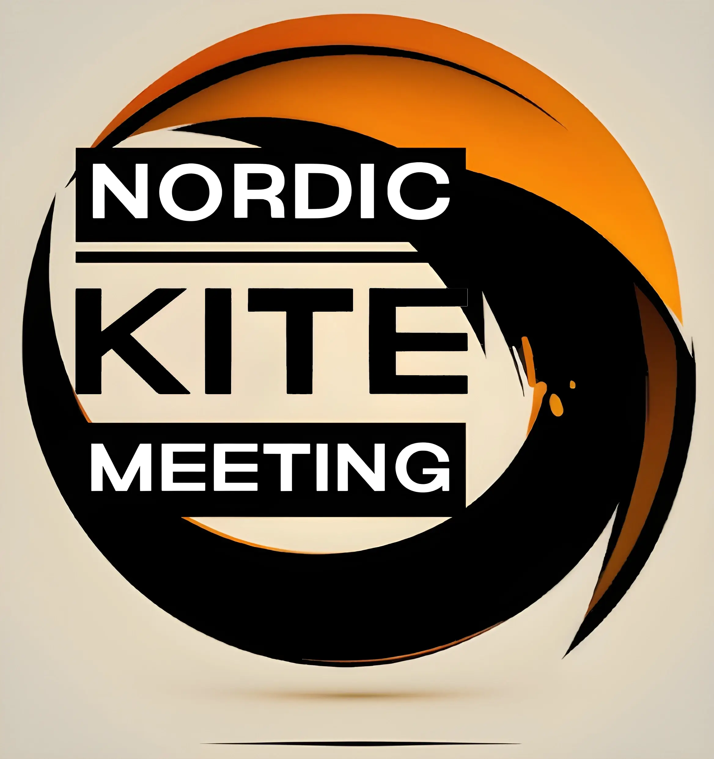
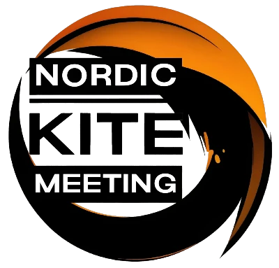
So I got on working from the top of my mountain and soon I was pretty satisfied with what I’d come up with. A brand new logo for the Nordic Kite Meeting!

I think this is looking really sharp! The colours are the official (?) AERIALIS colours, black and orange and like I write above, the circular shape – for some reason – makes me think of kites and kite flying. Finally, the text wraps it all up… the Nordic Kite Meeting!
I really hope to see you on Blokhus Beach, Denmark (May 22nd – 28th) for a great time flying kites at the 25th Nordic Kite Meeting!
